
The practical truth is this: a book cover is not decoration, it is a sales filter. In self-publishing, your cover determines whether a potential reader clicks, scrolls past, or never even registers your book’s existence.
It does not need to be beautiful in an abstract sense.
It needs to be readable at thumbnail size, instantly signal genre, and look credible next to traditionally published titles.
Most self-published books fail this test not because of bad writing, but because of avoidable design mistakes related to size, typography, and tool choice.
Why Book Cover Design Matters More in Self-Publishing
In traditional publishing, a weak cover can sometimes survive because of bookstore placement, marketing budgets, or author recognition. In self-publishing, the cover carries almost all of the first-impression weight.
On Amazon and other digital storefronts, readers usually see your cover at 100–200 pixels tall. At that size, detail disappears and only structure remains.
A good self-published cover does three things immediately:
- Communicates genre without explanation
- Establishes professionalism and trust
- Makes the title readable at small sizes
If any one of these fails, conversion drops sharply, regardless of reviews or pricing.
Book Cover Sizes: Getting the Technical Foundation Right
Ebook Cover Size Requirements
For Kindle ebooks, Amazon recommends a portrait-oriented cover with a height-to-width ratio of roughly 1.6:1. The most commonly used and safest size is 2560 × 1600 pixels, which provides enough resolution for all devices without creating oversized files.
Lower resolutions may technically upload, but they reduce perceived quality on larger screens and can look soft or pixelated when Amazon generates zoom previews.
Common Ebook Cover Size Standards
| Platform | Recommended Size | Aspect Ratio |
| Amazon Kindle | 2560 × 1600 px | 1.6:1 |
| Apple Books | 3000 × 2000 px | 1.5:1 |
| Kobo | 1600 × 2560 px | 1.6:1 |
Paperback and Hardcover Cover Sizes

Print covers are more complex because they include:
- Front cover
- Spine
- Back cover
- Bleed margins
The exact size depends on trim size, page count, and paper type. For Amazon KDP paperbacks, the cover is usually supplied as a single PDF generated using Amazon’s template system.
The most common mistake here is designing the front cover first and worrying about the spine later. Spine width changes with page count, and even small errors can cause text to wrap incorrectly or be cut off during printing.
Spine Width Reality Check (Paperback)
| Page Count (Black & White) | Approx. Spine Width |
| 100 pages | ~0.23 in |
| 200 pages | ~0.45 in |
| 300 pages | ~0.67 in |
Always generate the official template before finalizing print covers.
Fonts: The Most Underrated Design Decision
View this post on Instagram
Why Fonts Matter More Than Images
In marketplace conditions, the title typography matters more than the illustration. Readers often identify genre and professionalism from the font before they consciously process the imagery.
Fonts communicate tone instantly:
- Serif fonts often signal literary, historical, or academic work
- Sans-serif fonts suggest modern, business, or nonfiction
- Display fonts signal genre fiction but require restraint
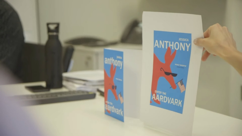
The most common self-publishing error is choosing a decorative font that looks good at full size but becomes unreadable at thumbnail scale.
Title Font Rules That Actually Work
Effective cover fonts share three traits:
- Strong contrast against the background
- Clear letterforms with open spacing
- Weight that holds up at small sizes
Thin fonts, script fonts, and novelty typefaces almost always fail on e-commerce platforms.
Font Suitability by Book Type
| Book Type | Font Style That Works Best |
| Romance | Elegant serif or script (bold) |
| Thriller | Condensed sans-serif |
| Fantasy | Custom serif or display (clean) |
| Nonfiction | Clean sans-serif or slab serif |
| Literary fiction | Classic serif |
Author Name and Subtitle Hierarchy
A strong cover has a clear typographic hierarchy. Readers should instantly know:
- The title
- The subtitle (if present)
- The author’s name
New authors often make their own name too large. Established authors can do that. Unknown authors should prioritize title readability.
Subtitles should support the title, not compete with it. If the subtitle cannot be read at thumbnail size, it should still be legible at full size without clutter.
Color, Contrast, and Marketplace Reality
Colors behave differently on screens than in print. Dark covers with low contrast often look elegant in design software but disappear on Amazon’s white background.
High-performing covers usually use:
- Strong light-dark contrast
- Limited color palettes
- Avoidance of mid-tone clutter
Genre conventions matter here. A romance cover that looks like a business book will struggle, no matter how clean the design is.
Color Strategy by Genre
| Genre | Common Color Direction |
| Romance | Warm tones, skin tones |
| Thriller | Dark backgrounds, high contrast |
| Fantasy | Saturated colors, textured depth |
| Business | White, blue, clean contrast |
| Self-help | Bright but simple |
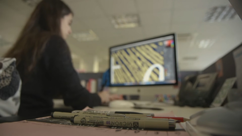
Best Tools for Self-Published Book Covers
@spellboundwithsydney Replying to @little.prince.tm once I have my design, I’ll export it as an SVG file and cut onto heat transfer vinyl using my cameo machine (same thing as a cricut). I weed out the excess vinyl from around the design and iron it onto my book cover using a heat press 🙂 if you want to see that process step by step I have tutorials on my page! 🤍 #bookbinding #diybookcover #bookrebinding #bookbindingtutorial #phantasma #custombookcover #canvatutorial ♬ カフェでボサノバを聴く休日 – ya-su
Canva: Practical and Accessible
Canva is widely used by self-publishers because it lowers the technical barrier. It offers preset cover sizes, drag-and-drop layout, and export options that meet most ebook needs.
Its limitation is originality. Canva designs tend to look similar if not customized carefully, and font control is limited compared to professional tools.
Affinity Publisher and Affinity Designer
Affinity tools offer professional-grade control without subscription fees. They are particularly well-suited for print covers, where bleed, spine accuracy, and export control matter.
They require more learning than Canva, but produce results much closer to traditionally published covers.
Adobe InDesign and Photoshop
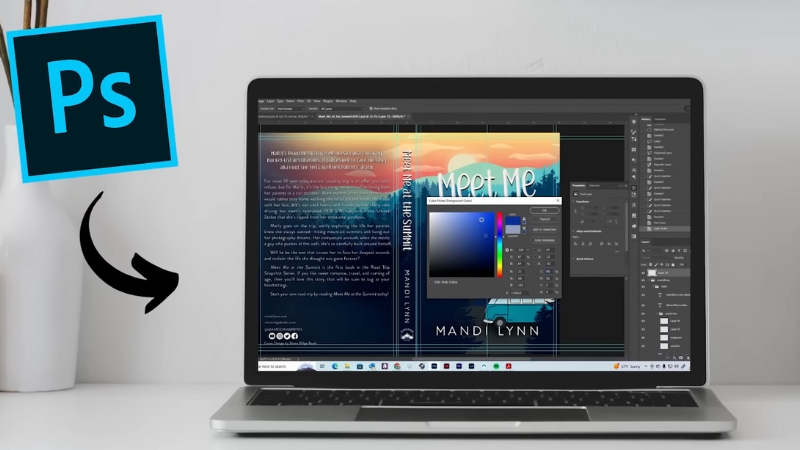
Adobe remains the industry standard. InDesign is ideal for full print wraps, while Photoshop excels at image-heavy designs. The downside is cost and complexity.
For most solo authors, Adobe is powerful but not strictly necessary.
Tool Comparison for Self-Publishers
| Tool | Best For | Skill Level |
| Canva | Ebook covers, fast setup | Beginner |
| Affinity Designer | Print and ebook covers | Intermediate |
| Adobe InDesign | Professional print covers | Advanced |
| Photoshop | Image-driven covers | Intermediate–Advanced |
Common Self-Publishing Cover Mistakes
Most cover problems fall into a few predictable categories.
One is designing for full size instead of thumbnail size. If the title cannot be read at a small scale, the cover fails regardless of detail.
Another is ignoring genre conventions. Readers rely on visual shorthand. Breaking those rules is risky unless you already have an audience.
A third is overloading the cover with text. Too many elements compete for attention and reduce clarity.
Frequent Mistakes and Their Impact
| Mistake | Result |
| Fancy unreadable fonts | Low click-through |
| Weak contrast | Poor visibility |
| Wrong genre signals | Reader confusion |
| Crowded layout | Reduced trust |
Testing a Cover Before Publishing
Before finalizing a cover, test it in real conditions. Shrink it to thumbnail size. View it on a phone. Place it next to top-selling books in your category.
Ask a simple question: Does this look like it belongs here?
If the answer is no, redesign before publishing.
Final Perspective
Book cover design for self-publishing is not about creative expression in isolation. It is about function under marketplace constraints. Correct sizing ensures technical acceptance.
Smart font choices ensure readability and genre alignment. The right tools ensure efficiency without unnecessary complexity.
The most successful self-published covers are not the most artistic. They are the ones that.